
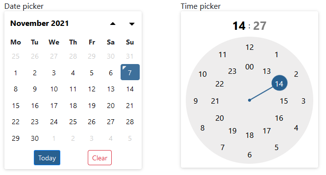
Simple date & time picker implemented in svelte.
Features:
- datepicker
- timepicker (with meridian support)
- various formatting options
- keyboard navigation
- includes
<input>element - easily themable
- restriction by start and end date
- validator action for
<input>usingsvelte-use-forms(optional) - custom element
npm install svelty-picker
<script>
  import SveltyPicker from 'svelty-picker'

  let myDate = '2021-11-11';
</script>

<SveltyPicker inputClasses="form-control" format="yyyy-mm-dd hh:ii" bind:value={myDate}></SveltyPicker>
Try yourself in REPL.
| Property | Type | Default | Description |
|---|---|---|---|
| name | string |
date |
html attribute for underlying <input> element |
| disabled | bool |
false |
html attribute for underlying <input> element |
| placeholder | string |
null |
html attribute for underlying <input> element |
| required | bool |
false |
html attribute for underlying <input> element |
| value | string |
null |
string representation of selected value |
| initialDate | Date |
null |
initial date object, if you prefer that to value |
| startDate | `string | Date` | null |
| endDate | `string | Date` | null |
| pickerOnly | bool |
false |
Picker is always visible and input field is then hidden, but still present |
| theme | string |
sdt-calendar-colors |
css class defining css variables |
| mode | string |
auto |
restrict picker's mode. Possible values: `auto |
| format | string |
yyyy-mm-dd |
Format of entered date/time. See format settings for available options |
| weekStart | number |
1 |
number in range 0-6 to select first day of the week. Sunday is 0 |
| inputClasses | string |
`` | input css class string |
| todayBtnClasses | string |
sdt-action-btn sdt-today-btn |
today button css classes |
| clearBtnClasses | string |
sdt-action-btn sdt-clear-btn |
clear button css classes |
| todayBtn | bool |
true |
Show today button |
| clearBtn | bool |
true |
Show clear button |
| clearToggle | bool |
true |
Allows to clear selected date when clicking on the same date when in mode='date' or mode='auto' resolving to 'date' |
| autoclose | bool |
true |
Hides picker after selection is done. If mode includes time picker, it closes automatically only after minute selection |
| i18n | object |
en |
localization object, english is by default |
| positionFn | function |
internal |
function used to position picker. Used as action. Acceps following object: { inputEl, visible}, where visible is visible parameter & inputEl is underlying <input> element |
| validatorAction | array |
null |
Bind validator action for inner <input> element. Designed to be used with svelte-use-form. |
Note: Properties starting by theme to i18n are configurable globally by overriding it in globally available config
import { config } from 'svelty-picker';

// set new locale
config.i18n = {
  // my localization object
}
// default for all pickers in the app
config.todayBtn = false;Date format can be defined under formatType property. It has two options: standard and php, where
standard is the default.
d: day of the month without leading zerosdd: day of the month, 2 digits with leading zerosD: short textual representation of a weekday (i18n.daysShort)DD: long textual representation of a weekday (i18n.days)S: English ordinal suffix for the day of the month, (i18n.suffix)m: numeric representation of month without leading zerosmm: numeric representation of the month, 2 digits with leading zerosM: short textual representation of a month, three letters (i18n.monthsShort)MM: full textual representation of a month, such as January or March (i18n.months)yy: two digit representation of a yearyyyy: full numeric representation of a year, 4 digitsh: hour without leading zeros - 24-hour formathh: hour, 2 digits with leading zeros - 24-hour formatH: hour without leading zeros - 12-hour formatHH: hour, 2 digits with leading zeros - 12-hour formati: minutes, 2 digits with leading zerosii: alias foris: seconds, 2 digits with leading zerosss: alias forsp: meridian in lower case ('am' or 'pm') - according to locale file (i18n.meridiem)P: meridian in upper case ('AM' or 'PM') - according to locale file (i18n.meridiem)t: timestamp in milliseconds (although milliseconds are always 0). For timestamp in seconds usephpformat
d: Day of the month, 2 digits with leading zeros 01 to 31D: A textual representation of a day, three letters Mon through Sunj: Day of the month without leading zeros 1 to 31l: A full textual representation of the day of the week Sunday through SaturdayN: ISO 8601 numeric representation of the day of the week 1 (for Monday) through 7 (for Sunday)S: English ordinal suffix for the day of the month, 2 characters st, nd, rd or th. Works well with jF: A full textual representation of a month, such as January or March January through Decemberm: Numeric representation of a month, with leading zeros 01 through 12M: A short textual representation of a month, three letters Jan through Decn: Numeric representation of a month, without leading zeros 1 through 12Y: A full numeric representation of a year, at least 4 digits, with - for years BCE. Examples: -0055, 0787, 1999, 2003y: A two digit representation of a year Examples: 99 or 03a: Lowercase Ante meridiem and Post meridiem am or pmA: Uppercase Ante meridiem and Post meridiem AM or PMg: 12-hour format of an hour without leading zeros 1 through 12G: 24-hour format of an hour without leading zeros 0 through 23h: 12-hour format of an hour with leading zeros 01 through 12H: 24-hour format of an hour with leading zeros 00 through 23i: Minutes with leading zeros 00 to 59s: Seconds with leading zeros 00 through 59U: timestamp in seconds. For timestamp with miliseconds usestandardformat
/** defaults */
.sdt-calendar-colors {
  --sdt-primary: #286090;
  --sdt-color: #000;
  --sdt-bg-main: #fff;
  --sdt-bg-today: var(--sdt-primary);
  --sdt-bg-clear: #dc3545;
  --sdt-today-bg: #1e486d;
  --sdt-clear-color: #dc3545;
  --sdt-btn-bg-hover: #eee;
  --sdt-btn-header-bg-hover: #dfdfdf;
  --sdt-clock-bg: #eeeded;
  --sdt-clock-bg-minute: rgb(238, 237, 237, 0.25);
  --sdt-clock-bg-shadow: 0 0 128px 2px #ddd inset;
  --sdt-shadow: #ccc;
}Component emits input, change and blur events.
inputis dispatched on<input>element therefore you can get current value like from every native event:changeevent is using Svelte'seventDispatcher, therefore triggered event containsdetailproperty
<script>
function onInput(event) {
  console.log(event.target.value) // logs currently selected date or empty string
}

function onChange(event) {
  console.log(event.detail) // logs currently selected date or null
}
</script>

<SveltyPicker on:input={onInput} on:change={onChange}></SveltyPicker>Localization file has following structure.
export const en = {
  days:        ['Sunday', 'Monday', 'Tuesday', 'Wednesday', 'Thursday', 'Friday', 'Saturday', 'Sunday'],
  daysShort:   ['Sun', 'Mon', 'Tue', 'Wed', 'Thu', 'Fri', 'Sat', 'Sun'],
  daysMin:     ['Su', 'Mo', 'Tu', 'We', 'Th', 'Fr', 'Sa', 'Su'],
  months:      ['January', 'February', 'March', 'April', 'May', 'June', 'July', 'August', 'September', 'October', 'November', 'December'],
  monthsShort: ['Jan', 'Feb', 'Mar', 'Apr', 'May', 'Jun', 'Jul', 'Aug', 'Sep', 'Oct', 'Nov', 'Dec'],
  meridiem:    ['am', 'pm'],
  suffix:      ['st', 'nd', 'rd', 'th'],
  todayBtn:    'Today',
  clearBtn:    'Clear',
  timeView:    'Show time view',
  backToDate:  'Back to calendar view'
}
PRs for extending built-in localization are welcome 🥳
- Bootstrap datepicker for some internal date and format handling
MIT